Jump to content

Recommended Posts

Posted

boston very nice ! can you tell me at which focal length it was shot ?

zubin: photography-on-the.net is good for Canon photographer... dunno if you're one though. still good anyway.

Posted

joelz: Seriously, if you want to take bokeh shots, buy a goddamn lens that can render good bokeh. Those shots sure are colorful, but the light disks are shit

Posted
lol 123456789

im seriously just trying to increase your ability and willing to offer my advice. if you're about to dismiss this as laughable then i'll refrain from responding - you're more than welcome to ignore my opinion if you like.

boston very nice ! can you tell me at which focal length it was shot ?

taken with a 20mm lens on medium format film

Posted

like the play with textures, just the last one strikes me as a bit more bland than the others.

as my photography capabilities and equipment is limited, this is how i choose to shoot most of my subjects...focusing on some interesting juxtaposition/contrast of different textures and surface patterns.

Posted

ozone you seem to be posting a ton of stuff - use some discretion in which pictures you post up. in your first post today i really like this one

vmrv4y.jpg
as it is the strongest technically and composition wise - i'd urge you to explore the use of curves to edit more contrast into that black and white. it makes it pop more and would really set it apart. i love the repetition tho. also this one
jhstc9.jpg

looks like it has potential compositionally, but the blacks are too dark and those shadows deter from the overall picture. with curves you would be able to maintain that darkness in the roots on the rock foreground left side but hopefully (depending on original exposure) be able to bring out some detail in those shadows underneath the rock. ideally if you had taken this with a higher aperture value such as f11 or even f22 - more detail would have been captured in those shadows.

alf i really like what you've done with the textures except for the last one, but always be cognizant of the lines in the texture and make sure to frame them compositionally. for example i think if #1 had been taken at a dead on angle to the wall it would have been better, but i love the crack in #3 leading away from the perspective angle that you were with the wall when you took it.

and one more scan from this shoot.

portfolio15tc6.jpg

Posted

When i look at your image Boston, Im automatically drawn to the largest graffiti on the right of the frame, so it kind of bothers me that the crop cuts off part of it

Posted
joelz: Seriously, if you want to take bokeh shots, buy a goddamn lens that can render good bokeh. Those shots sure are colorful, but the light disks are shit

I thought they were alright?

The shape of the lights are nice and circular and not all jagged and angular like with a cheap 50 mm.

Posted

Back from hiatus, sharing some gig photos I taken over the past few months.

3094873725_c3f435bb73_o.jpg

3095731774_24a4bdb6fa_o.jpg

3095786810_23ff3830c7_o.jpg

3188369170_2a06bed43a_o.jpg

3224184597_d08537d19d_o.jpg

Posted
When i look at your image Boston, Im automatically drawn to the largest graffiti on the right of the frame, so it kind of bothers me that the crop cuts off part of it

sorry, no crop though. when i was composing it i wanted the broken pipes lower left in the frame so i sacrificed the grafitti over there.

back to work tho sadly.

girlbball-2.jpg

girlbball-7.jpg

Posted
sorry, no crop though. when i was composing it i wanted the broken pipes lower left in the frame so i sacrificed the grafitti over there.

maybe another angle would have been beneficial, as from this perspective the large, bright window catches my eye then pushes me to the graffiti, which makes me assume is the main focus

Posted
maybe another angle would have been beneficial, as from this perspective the large, bright window catches my eye then pushes me to the graffiti, which makes me assume is the main focus

another angle might have been better to include that graffiti on the right yep. that twas actually the intention tho to focus on the light. the purposeful overexposure of everything outside was meant to offer a stark contrast to the desolate surroundings of the graffiti that you only see after the fact.

Posted

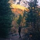
Pretty much a post card photo but I really like how the sunrise briefly lit up the mountain. This is my quiet part of the world..

img_0030.jpg

Join the conversation

You can post now and register later. If you have an account, sign in now to post with your account.

Guest
Reply to this topic...

×   Pasted as rich text.   Paste as plain text instead

  Only 75 emoji are allowed.

×   Your link has been automatically embedded.   Display as a link instead

×   Your previous content has been restored.   Clear editor

×   You cannot paste images directly. Upload or insert images from URL.

×
×
  • Create New...