Jump to content

opinions, please


Dex_star

Recommended Posts

Yeah not really my style, but some comments:

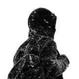
I'd work on the cropping, particularly on the right side. The arm looks wierd cropped vertically like that. I'd probably extend it so it looks more like the left arm.

I'm thinking you used something like the "cutout" filter in photoshop to make this. If you practice drawing vectors yourself using Illustrator or Painter or something you can play around with line widths and shadows etc to make the image more styalised. That's something I'd recommend to make your work look more professional and unique.

Link to comment
Share on other sites

its pretty good for something simple just a cutout it looks liek (previously mentioned)

on the right art i say rather than extend the arm end it in a stylized way or something like have it fade into some sort of pattern or a pattern of black overcoming it

i dont know im just blowing smoke out my asshole at this point

but like just said, learn to rock the pen tool like no other and youll have a much higher quality logo

but dont let peoples first opinions drag you down

it looks like a really good beginging/rough draft to me!

Link to comment
Share on other sites

thanx guys

as far as it what it means/represents its more of a personal issue rather than a public one. i kno that wont help with ur interests but thats the best way i can explain why i designed it

as for the cropping and vectoring. yea i suck at this stuff. i just kno what i want and how i want it to look. as far as professionalism goes it doesnt bother me much. i like how it came out. plus sometimes i think vectored images can look corny (i.e. lots of threadless stuff)

thanks so far, please comment more

Link to comment
Share on other sites

Since the design itself seems to be personal and therefore unchangable, I'm just going to stick with design elements here... If this were my project, I would either make the image a tiny bit smaller, then move it so the bottom of the crucifix touches the the bottom hem, or fuck all, don't change the size and have it overlap the hem for a dramatic effect. Also, dealing with the subject matter vs. design, I would change the whole thing tonally, removing those bluish greys in the shadow of the hand and cross. Unless this is exactly what you were going for (and it very well could be), the almost pastel tones take away from the dramatic effect of the subject matter, or, well, at least in my opinion. Maybe replace those tones (hue effect on photoshop) with something in the reddish area, or just a slightly off-white tone? And for something really off the wall, you could even print the rosary beads in black, on the black shirt, versus the hand in white, so the viewer would have to strain to see exactly what was going on, creating a really interesting effect. But I don't know if that's what you're going for!

Link to comment
Share on other sites

Join the conversation

You can post now and register later. If you have an account, sign in now to post with your account.

Guest
Reply to this topic...

×   Pasted as rich text.   Paste as plain text instead

  Only 75 emoji are allowed.

×   Your link has been automatically embedded.   Display as a link instead

×   Your previous content has been restored.   Clear editor

×   You cannot paste images directly. Upload or insert images from URL.


×
×
  • Create New...