

Icarus
-
Posts
1749 -
Joined
-
Last visited
Content Type
Profiles
Forums
Events
Gallery
Store
supertorial
Classifieds
Posts posted by Icarus
-
-
It is a little bit of this, a little bit of that.
Why worry?
0 -
Pin and roll.
0 -
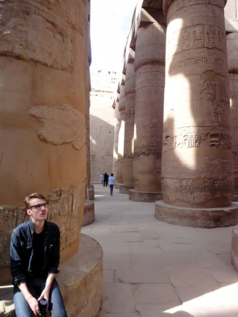
Luxor, Egypt:
...denim edition?
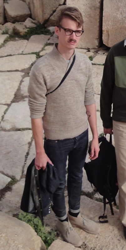
Jerash, Jordan:
and of course I cropped a FAMILY PHOTO
0 -
Ride the art.
0 -
Am In In Am I In
0 -
There are maybe two for vintage, but nothing for thrift. Have to find spots in New Hampshire.
Boomerangs in Somerville has a little, and it is all sorts of whacky so it is worth a visit. There is also Bobby from Boston, which I have never been to, in the S. End. It sells vintage E. Coast, prep, work wear, bowling, etc. I might visit tomorrow myself.
0 -
In what sort of emergency can't you do both? Besides the dire straits of your life, that is.
0 -
yea! is totally right. Best match is URW Garamond demi-Italic. Spot on fit. Thanks a lot, team. I should have turned here sooner. I am going to peg the FIELD STUDIES font as Futura Black.
Now, is there a sweet .otf collection somewhere without the wonky free fonts modifications? Would rather not pay 100 smackers for the family, although I could easily continue to print screen/ paste. I do feel like a clod stumbling into your realm with a clunky design and a bunch of silly questions.
0 -
yea it fits perfect now after wearing it for over a day. Too bad one of the zippers came partly off after the glue lost hold. Not hard to fix. Similar price to a full TOJ perfecto but has a bit of versatility to it IMO.
I don't know if it's versatility, but that is one of my favorite pieces period. Glad someone bought it before I broke down and revamped everything.
0 -
I do indeed.
0 -
Hyde Park, this was over a year ago. Ended up downgrading the entire bike, from a Viner to a Fuji. Kind of shocking that someone would be looking for hubs down here and not a mountain bike/hybrid to cut. I should get pictures of my bike up, I lurk this thread too much.
0 -
Oh lord. My girlfriend got her entire wheel set jacked, old Wood hubs. At least your buddy kept his tires and rims. Expensive parts in urban area are going to get stolen. Rough nonetheless.
0 -
Jermaine, have to spread rep.
Bodoni is super close, and definitely close enough for my use. Seems ever so slightly off. Perpetua ain't it. Degredation is probably coloring my perception of the match. The tapes came out looking great, but I was bugged by the poor DPI of the scans I used to lift the type.
0 -
I turned this out in a day this summer for a on the spot benefit cassette I cut for a bunch of avant/new wave-synth heads that had almost the entirety of their gear stolen at No Fun Fest. New Age double header. Edition of 60, recorded and packaged in 24 hours.

I am looking for the name of the cover font, it's not just arial italic bold, and it's the classic academic journal font. Any ideas? This is a CS, so the black lines are fold lines. Clearly, a bit rough, but I would love to get pointers from those with actual design experience.
0 -
Love the cut of the pants, but that image is the idealization of a period of distinct cultural hegemony; it's moralizing. There seems to be a policy of selective analysis when looking at Ivy style. Ah yes! The cricket sweaters look smashing with the slicked back hair in these old Kodachromes! The fact that our stylistic magpie-ism totally ignores the social aspect of dress and circumstance is problematic, especially at the level of wholesale adoption of a style. Fetishizing the styles of a privileged hegemonic cultural without grappling with the secondary effects of its expression seems to be pretty par for the course when it comes to this whole Ivy Style movement. I hate to sound off on your post, but the clarity of message in that piece is exemplary. Dudes just look like they are gearing up to go to a dance to fight some Italians in that wholesome Yankee way.
Clearly, this can be found in many if not all fashion trends, especially high fashion. The laudatory nature of the whole industry is pretty noxious.Anyways, let's keep to re-integrating punks and skins back into mainstream culture through the style market.
So, uh, clearly:
 0
0 -
So dope. If I had the wardrobe to rock it, you know IT
0 -
Get a skinnier boyfriend!
0 -
Wow, thank god I just bought a rain jacket. This is grail, and thankfully redundant for me at the moment. Beautiful jackets.
0 -
Are the FAP/CWG/NSFW more active on Saturday nights for a reason? They are always at the top of the trash. STUDIES SHOULD BE MADE.
0 -
JimmyC ruling it with that Buddha Machine. I need me about 10 more of them for optimal proximity interference.
I look on this swap with jealousy, I should have done it again!
0 -
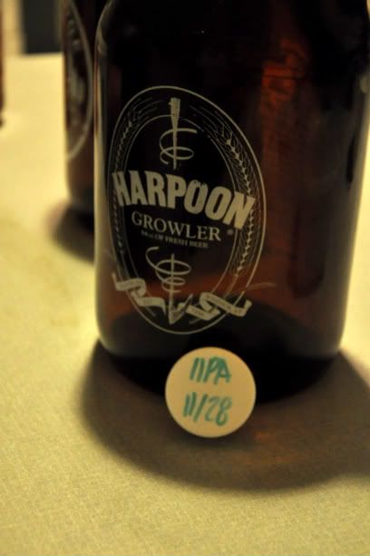
When in Boston: Harpoon Leviathan Imperial IPA, brewed today.
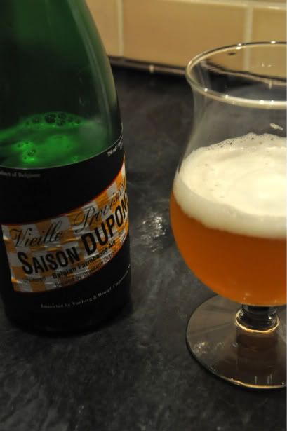
To cap a night off:
 0
0 -
If you didn't have such teensy feet I woulda' been all over those jazz shoes.
0 -
My whole body aches, wild cough whenever I stand up, headaches, and now I can just feel the fever setting in. Can't work on anything, let alone go to work/class.
0 -
You and everybody else, bub.
0
state your beer, drinkers
in superculture
Posted
Don de Dieu is certainly my favorite Unibroue. They are all a great deal, and easily beat out Ommegang and Allagash in the budget bracket, and are on par with Affligem (though with a wider range).
I find them lacking, however, when stood up against anything outside of their price range; they all seem to have a single dominant, overpowering taste and weak finishes. That being said, I probably drink more Unibroue than anything else.