

candidate
-
Posts
48 -
Joined
-
Last visited
Content Type
Profiles
Forums
Events
Gallery
Store
supertorial
Classifieds
Posts posted by candidate
-
-
Hi there, I was just wondering whether you guys could give me some help here.
I'm looking for all the NY fashion week designers that are more progressive and a little bit more subversive on the schedule and off the schedule. I'm based in London and haven't got too much of a grip on what's going on in New York. I got given a list, but Samantha Pleet, Emerson and Sarah Taylor aren't what I'm looking for aka they're boring as shit.
Looking for the NY equivalents of Cassette Playa, Nasir Mazhar, basically everyone in MAN, Louise Gray etc
Thanks.
0 -
Sorry should have posted in Superfashion questions
0 -
Joseph Nigoghossian's first kiss.
5OxPCpJeytw
0 -


XS Rick Owens drop crotch skinny tracksuit bottoms. Nice trousers but I don't wear them at all. Worn 4 times. Dry cleaned once and hand washed once. Bought for $585 from RO London last season. SOLD

XS Rick Owens Brown Vest Never Worn possibly still have tags. perfect condition. bought for $247 from RO London. $130 Price Drop %115
0 -
Soldddddddddddddddddddddddddddddd
0 -
Black Dior Homme shirt worn once SIZE 37(xs/s)


$80
-----------------------------------------------------------------------------------------------------------------------------------------
Dior Diamonds T shirt SIZE XS
worn once aswell.


$60
0 -

Worn once around the house and practically brand new. They have no marks or stains. They have just been sitting in my wardrobe for ages. They are like 9 inches too long on the leg and i havent gotten round to tailoring them and dont think i will.
Fit pics:


SOLD
0 -
hey shameless plug i know, but the blog i showed everyone in this thread a few months ago is up for a dazed and confused blog award.
I know some people liked it and it would be great if you could just take one click to vote for SAMESIES
http://www.dazeddigital.com/projects/BlogAwards/Finalists.aspx?Category=Photography
thanks superfuture.x
0 -
check that also0
-
dude you've got it wrong. it isnt trippy like that
http://www.yooouuutuuube.com/v/?rows=18&cols=18&id=pAwR6w2TgxY&startZoom=1
you have to have smaller amount of rows and columns. check that one for a better one.
0 -
corter i hope it's alright to use one of your pics? cool.
0 -
for some reason i really, absolutely love this idea. not because of the similarities really, but because it allows us to view two similar photographs and get completely opposite feelings from them. It really forces the viewer to pick out small details in each that a quick glance just wouldn't reveal, making each photo more interesting even when seeing its (in some cases almost identical) counterpart.
thanks very much corter, i totally agree with what you are saying. at first i didn't believe that it would be anything more than identical pictures but it has put a whole new perspective on viewing photography.
another aspect of it is that it is an original way for people to get to know good photographers. one of my main objectives with it is to get people to know about all these amazing photographers from every corner of the globe. it's going really well at the moment and we've found loads of different unimaginable pictures that are similar.
0 -
-
yo guys. I have started a new flickr project called "samesies"
http://www.flickr.com/groups/samesies/
the idea is that people can essentially take the same photo as someone else without realising. another guy and me are compiling them in a blog. follow and join.
0 -
-
fuck loads of new photos. a few from banksy's new exhibition.
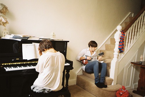
Banksy.
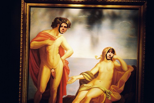
Banksy.
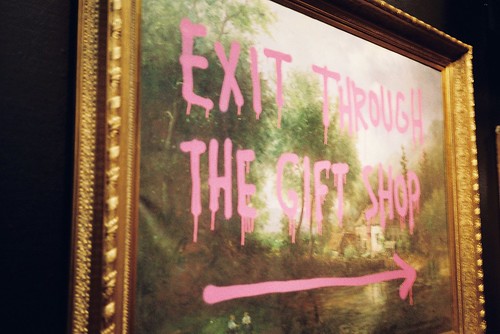
Banksy.
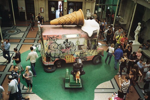
Banksy.
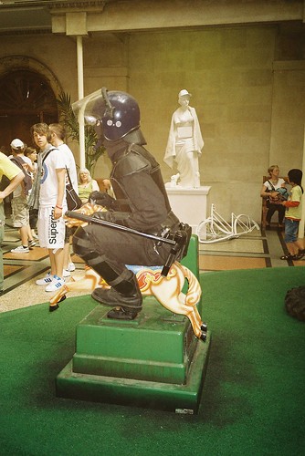
Banksy.
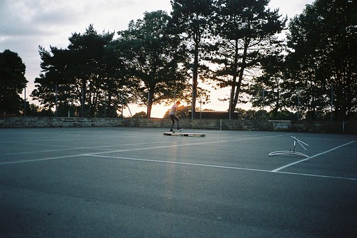
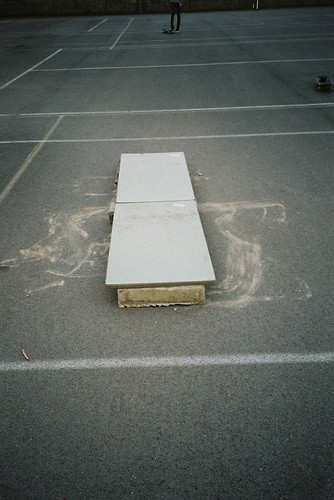
homemade manual pad.
 0
0 -
elegant, romantic goth
 0
0 -
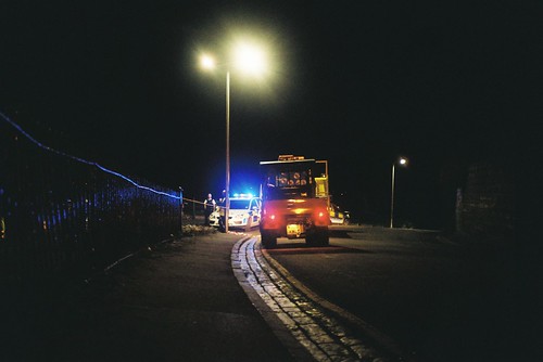
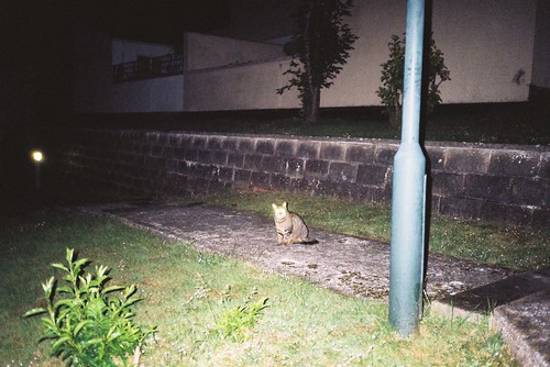
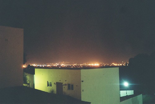
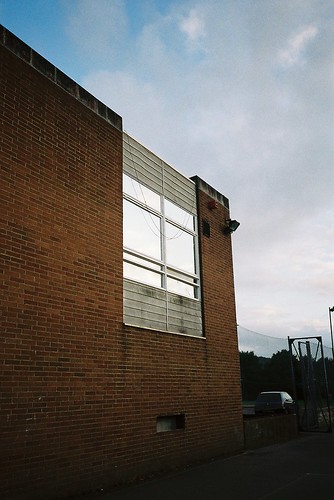
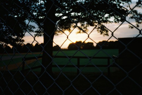
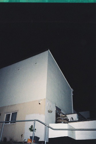
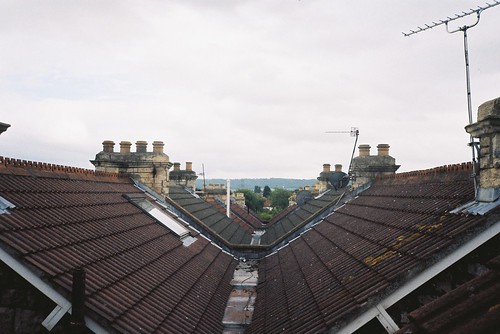
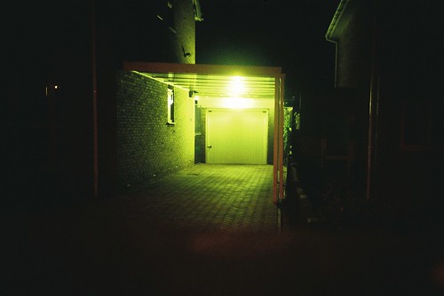
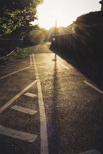
not very good at night photography. dont use the right film.
0 -
^^ really like the mood and lighting in the first shot, I just wished there wasn't so much lens flare and the blacks definitely need to be blacker.
Not a real fan of the rest:
2. Alien-looking shadow is interesting, but why the figure placement? Why the setting of the picture, why the skateboard? I think you might be on to something that needs to be better developed.
3. Don't like the figure placement with half of him cut off. Too much sky. I think if you would've exposed for longer than then burned the bright part of the sky, then you'd have more detail and a better image
4. Cool shallow DOF, but rule of third?
5. Waste of space
6. I think you could've done a lot better arranging the wires in the frame that would've made it more interesting
yeah to be honest im taking these pictures on a snapshot film camera. they are basically just snapshots of what i see. i should use an slr more but they arent pocketable.
oh and 5. shows the moon in the daytime which i really liked.
thanks for the crit though. much appreciated.
0 -
-
-
sorry dont know much about the camera. noob mistake.
0 -
loganl what lens have you got on that electro?
0 -


good hip hop
in superculture
Posted
I shot with SGP whilst he was over here in London. The most interesting guy in the game.
http://www.vice.com/en_uk/read/spaceghostpurrp-is-my-new-bff?Contentpage=-1